
First, I printed out the 8 pictures that I wanted to use, light-boxed over them with ink three times (once for dark, once for mid tone, and once for light), then scanned each light-boxed sheet into photoshop.

Next, I used the threshold tool to change each scan to pure black and white. I then removed the white from each scan and put a white background in as the bottom layer.

The next step I took in the process was to experiment with the colour of each layer. I decided that the three below were too bright and saturated so I chose not to use this colour schemes as they didn't look as aesthetically pleasing as I wanted them to.


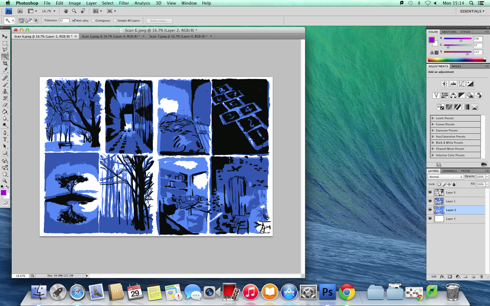
I then chose to try a cool colour palette with just blues and black as the colours of the three layers. I liked this colour scheme much more than the other three I'd experimented with before as it was more subtle and the colours work together more. However, I still wasn't satisfied as I felt that the colour scheme was too cool and I wanted a warmer colour scheme.
The next two colour schemes I tried were warmer. I decided that I didn't want to use the red one as I felt that, even though the scheme was closer to what I wanted, it was too warm and needed to be toned down a little more to pull it back so it didn't look over saturated or too warm.

The pink colour scheme was much closer to what I wanted but I chose to use a different colour scheme as I was still unsatisfied with the colours and wanted something a little cooler than this yet still warm at the same time.

In the end, I chose a purple colour scheme. The reason I decided on this colour scheme was that I found it more aesthetically pleasing than the others and the colours were cooler than the red and pink colour schemes but warmer than the blue colour scheme. I also felt that the colours worked very well together and there was a nice contrast between the black and the purple in the images.


In the end, I chose these three as my favourites as the colours worked very well together in these particular images and the painterly brush markings were more physically appealing as opposed to the markings in the other images I had created. The black and purple create a nice contrast that is easy on the eye and there is a good variation in the brush markings of the ink I had made when first creating the different layers for the aspect to aspect pictures.


