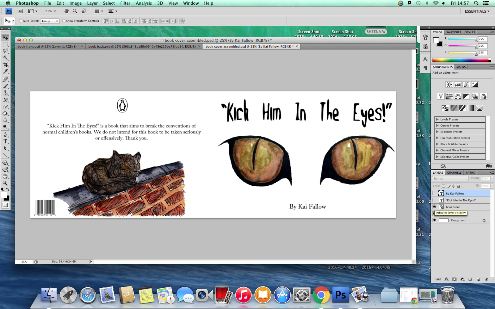
First, I opened up a new document in photoshop and imported an illustration of cat eyes I had done in dip pen and watercolour into the document. I then began to add the different components of the front cover and centre-aligned it to give it more order and hierarchy as opposed to making everything different alignments which would look messy and not as effective.


For the back cover, I added in the publishing logo for the book and a barcode and placed them so they were both centre aligned at the top and the bottom of the page. I made them bigger than I wanted them to be so that I could get a rough idea of how they would look on the page.

Next, I imported one of my illustrations of the cat and moved the barcode, decreasing the size so that it wouldn't take attention away from the illustration. I also made the publishing logo smaller for the same reason.

After doing this, I added in the blurb of the book and centre-aligned it so that there was more order and hierarchy within the composition. This then prompted me to increase the size of the illustration so that it catches the eye and moved elements of the design down a bit so that everything was in a closer proximity to each other, establishing the relationship between them all. I also increased the size of the barcode a little but kept it to the left side of the page.


Finally, I added both parts of the cover into a new photoshop document and added in the text I would need for the spine. I used the same typefaces as I did for the front cover to create consistency within the piece.


Final Result: