
Creating my double page spreads, I opened up four new photoshop documents and imported the illustration I would need for each page onto each one. I then also imported the body text for each page and changed the font to one of the typefaces I had made digitally. I made sure that the images were large and noticeable on the pages with the body text close by to indicate the relationship between illustration and narrative.
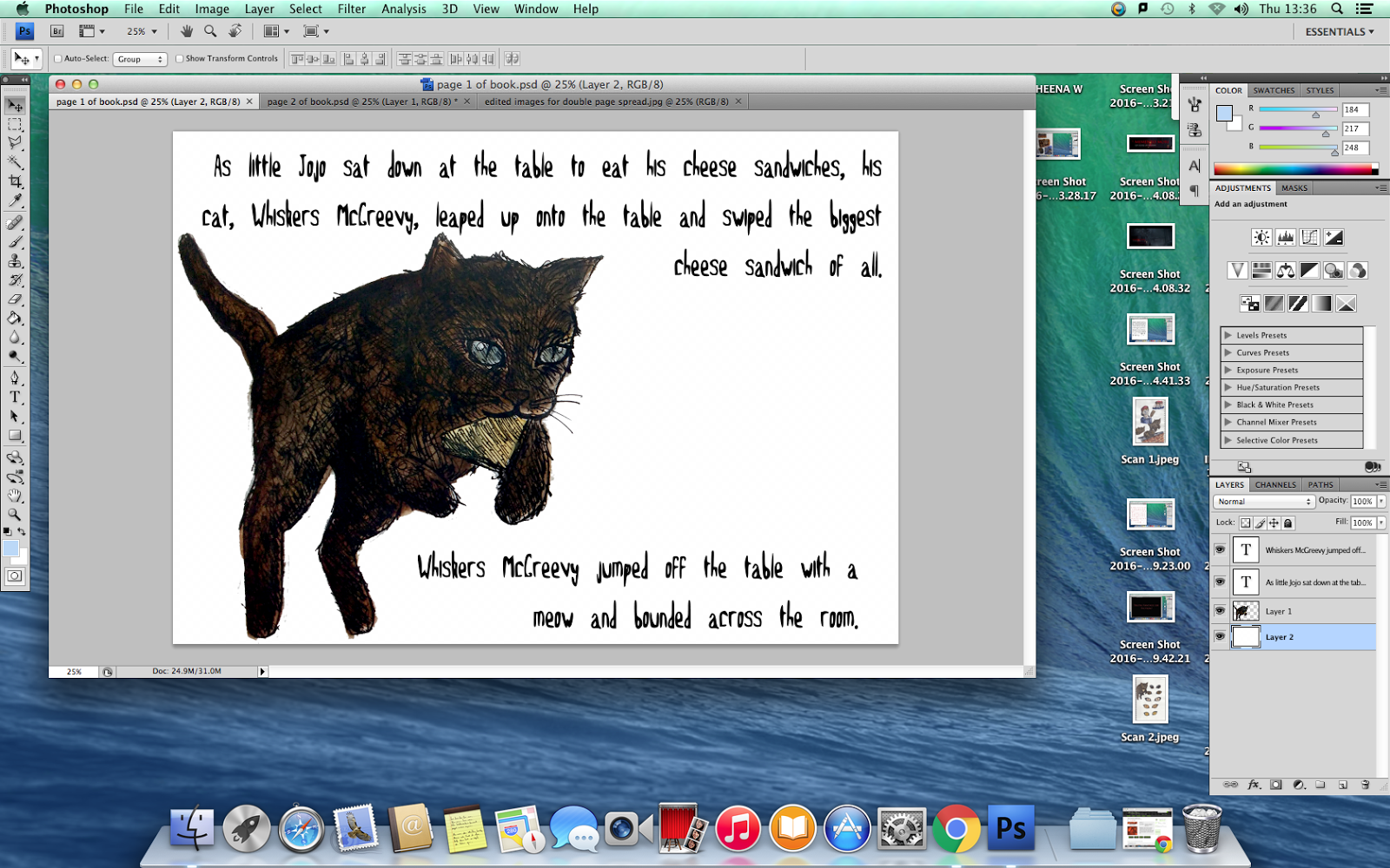


Upon reviewing these pages, I decided that the typeface for the body text would have been more difficult to read and unsuitable for the font's purpose. As this is a narrative, I chose an old-style font that is far more legible than the one I had created as that one was more like a display type and not appropriate for a children's book. I then also moved and re-sized some of the illustrations as well as altering the positioning of the body text so that it was more organised and the illustrations would be easier to see as opposed to before.


I then proceeded to place the pages into new photoshop documents and arranged them so that they were laid out like double page spreads. When i did this, I noticed that some of the body text wasn't in line with the rest so I changed the positioning in order to make it look more organised and tidy.

Final Result:


No comments:
Post a Comment