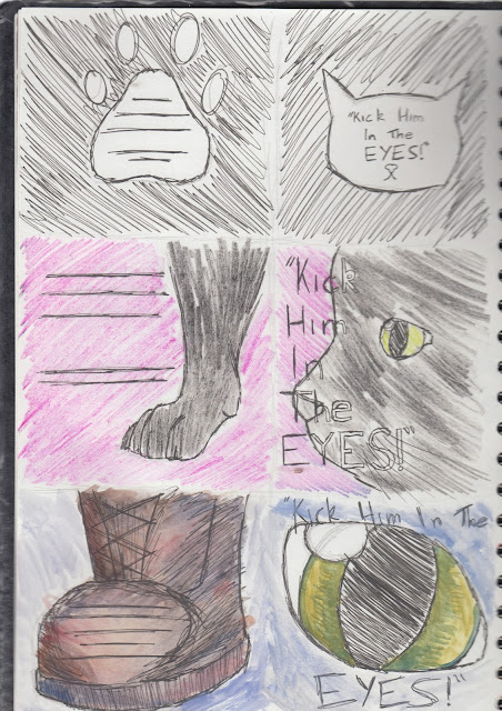
For my scamps of initial ideas for the cover of the book I'm doing for my final piece, I decided to use a variety of materials and colours in order to determine which techniques I liked the most before experimenting so that I would have a wide range of combinations to choose from. I also chose to use different layouts so that I could see which would look the best and encourage a prospective reader to pick up the book and read it.
I chose to leave some backgrounds as plain white in order to simplify the design and draw more attention to the illustration and title of the book, whereas I used coloured backgrounds on other designs to make the cover stand out and catch the eye. Not only this, but I experimented with strange layouts of image such as the design of the cat eyes on the boots both to intrigue the prospective reader and to represent what the book is about in relation to the title of the book itself.
The Scamps:
 |
| Materials used: watercolour paint and fineliner (top), ink and fineliner (middle), watercolour paint and black gel pen. |
 |
| Materials used: wax crayon and fineliner (top), wax crayon and gel pen (middle), wax crayon, fineliner and felt pen (bottom). |
 |
| Materials used: felt pen and fineliner (top), fineliner (middle), coloured pencil and gel pen (bottom). |
 |
| Materials used: fineliner (top), coloured pencil and gel pen (middle), watercolour paint and gel pen (bottom). |
 |
| Materials used: watercolour and gel pen (top), felt tip and gel pen (middle), wax crayon and gel pen (bottom). |


No comments:
Post a Comment