Tuesday 24 November 2015

Typography - Hand Drawn Fonts

Whilst looking for different types of fonts to use, I also looked at handcrafted typefaces. This is because I feel that some handcrafted fonts have more aesthetic value than digital fonts and I wanted some inspiration for different experiments I could try out such as calligraphy or using different mediums to achieve various textures. 


Typography - Digital Fonts

Fonts I Chose From dafont.com

When considering fonts to use both on the cover and the inside of the book, I immediately decided that I wanted something that all ages would have no trouble reading. This is because the primary target audience for my product is younger children and so they need a typeface that is legible and clear. With this in mind, I started looking through different fonts on dafont.com to get an idea of the sort of fonts that would be close to what I was looking for. 


The next step I took was to write the most recurring line from the book in the fonts that I had chosen. This was to compare how each font looked and which one looked the best. I chose these fonts in particular as they are all easy to read. I selected a mixture of old-style, modern, script and display fonts so that I could determine which typeface was the most effective and the best suited to the purpose I wanted the font to have. 


Comparing Typefaces

When comparing typefaces, I felt that the font Easy Open Face (the second typeface on the list at the top) would be one of the least effective in regards to what the main body of text could be written in. Whilst it may be eye catching and easy to read, I felt that the font wasn't suitable for the main body of text as it would be too distracting and not as easy to read. After carefully looking at each font, I have decided that the two fonts that I would consider the best to use for my book are OldStyle and Lemon Yellow Sun. 

I find OldStyle to be one of the easiest to read and, for me, it looks more traditional. It reminds me of Times New Roman as it has similar transitions in weight which gives it more aesthetic but not so much that it would distract the reader of the book. The weight of certain elements of the letters make it stand out which is what I'm looking for with the typeface for the main body of text. There is not so much contrast from thick to thin weights so it doesn't distract the eye or take away any legibility. 

I also chose Lemon Yellow Sun as its qualities as a handcrafted script font contrast with the traditional qualities of OldStyle. There is no transition in weight and the messy quality is reminiscent of simplistic handwriting which makes it easy to read. The font has a medium weight so it stands out on the page but still has legibility and the way the letters are all capitalised means that you can read it effortlessly. 

Monday 16 November 2015

Mid-Point Drafting 2

For these drafts, I chose to use pencil and pen rather than watercolour paint. I did this to create more interesting marks on the page as opposed to that of the paintbrush and to achieve a more childlike and messy quality to the design.


Saturday 14 November 2015

Locations - Wax Illustrations

In order to experiment with texture within my illustrations, I decided to use wax crayon. This is because this particular medium gives a rough, messy quality that often has the connotations of childhood and younger children. I also wanted to experiment with layering colours with wax crayon in order to create interesting tones and shades. 


After using just wax crayon, I decided that I wanted darker outlines that were more defined. To accomplish this, I used a black gel pen to roughly sketch out the outlines and then coloured the images with wax crayon. I once again layered different colours to create tone and shade but I also added messy gel pen lines over the top to add more shadow and create more aesthetically pleasing illustrations. 


Thursday 12 November 2015

Illustrations For Locations - Added Detail

I decided to add a different medium on top of the watercolour paint I used on the location illustrations that I drew out. I did this as I felt that there wasn't enough tonal range within the illustrations and that they needed more colour in order to increase the aesthetic value. The medium I used on top of the base colour was watercolour pencil as I felt that this would work better and I would be able to add more detail as well as having better control over the colour choices. Using watercolour pencils also enabled me to be able to add darker shading in places where it was needed and it was easier to graduate this into lighter tones. 


Wednesday 4 November 2015

Mid-Point Drafting 1

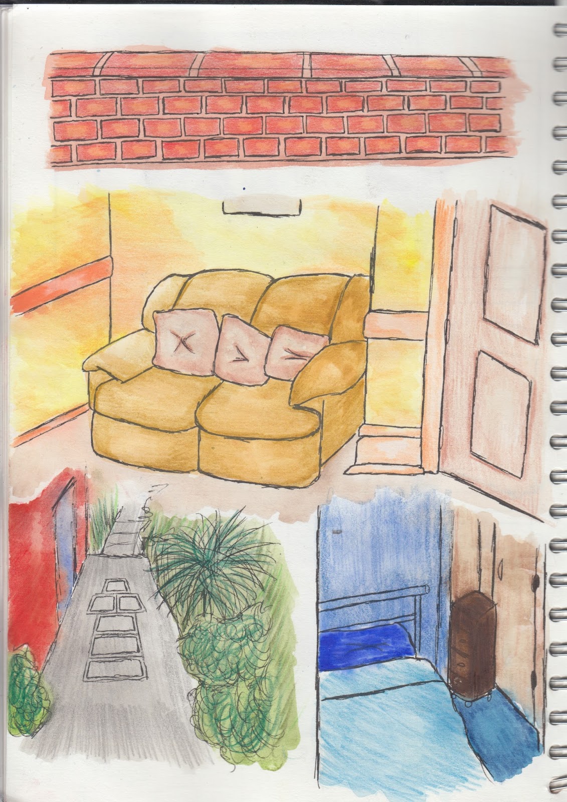
For my first mid-point draft of the cover and pages I am creating for my final product, I decided to use watercolour and fine liner. I also used a simplistic design like E.H. Shepard would have done and added colour to the backgrounds of the front and back cover. I drew simplistic illustrations for the characters and used lines to plot out where the main body of the text will be placed. 


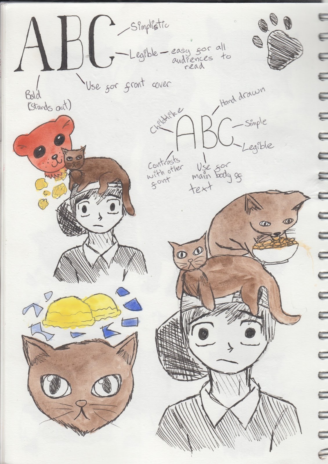
For the front cover, I used the illustration of a cat's eye as the cat is one of the main focuses of the book. I made the eye green in order to make it contrast with the brown-black of the back ground as well as the black font of the title. I considered a bold, modern typeface that catches the eye and stands out as one of the main aims for creating a cover for a book is to catch the eye of a prospective buyer. 

For the back cover, I used a simplistic illustration of a boot in order to link with the title and create consistency. I also used warm browns and reds for the boots and a pale, muted blue background to create contrast not only with the illustration and the background, but also with the blurb which will be in a black/dark typeface.

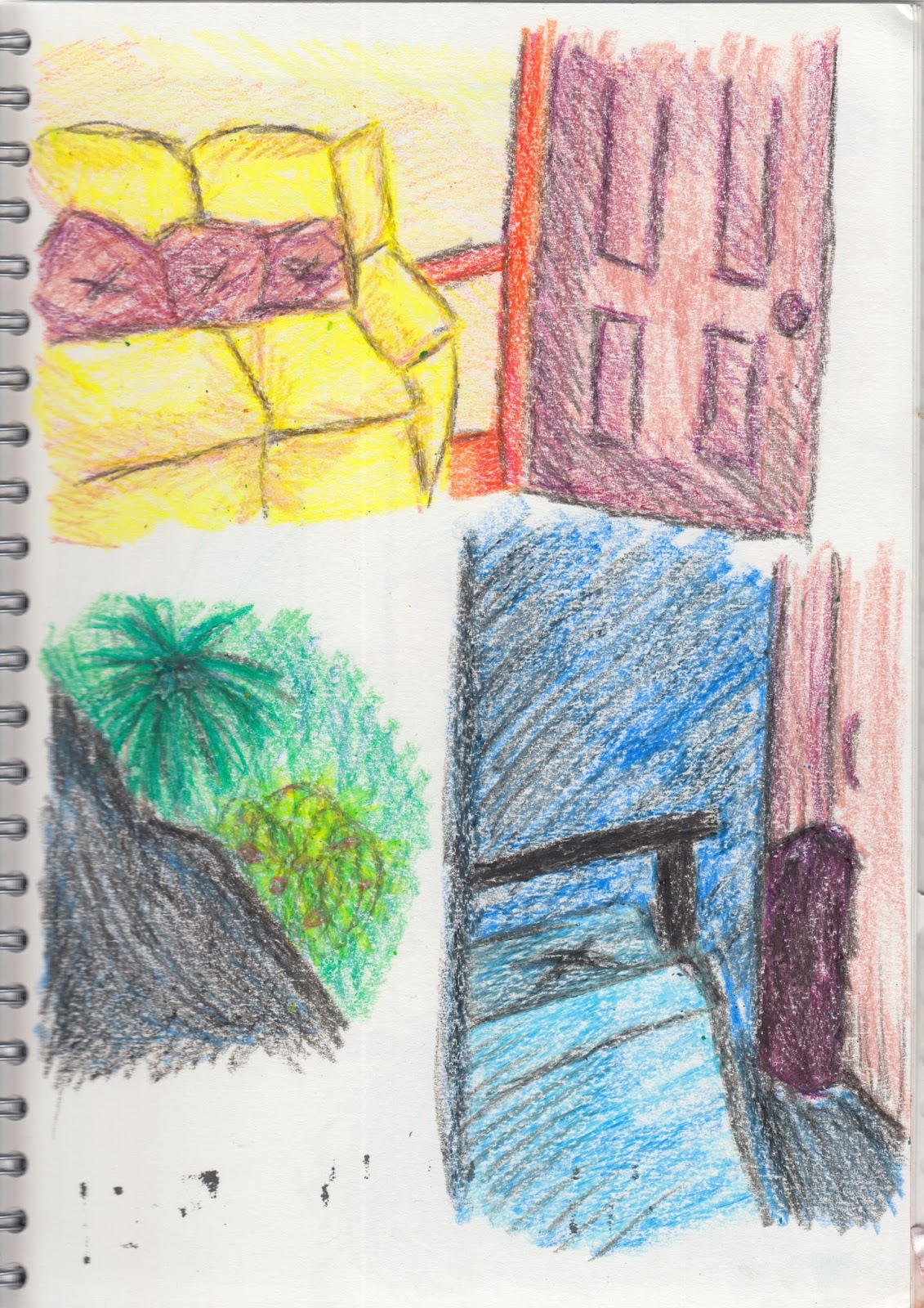
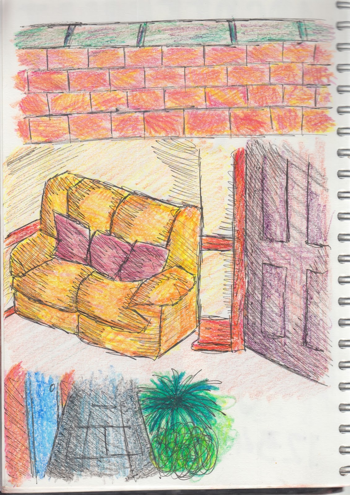
I used simple illustrations when designing the two DPS as I don't want complicated illustrations that will distract from the narrative. I also used illustrations that link directly to the narrative of the book and simple colours that are saturated but not so saturated that they detract from the main body text. The backgrounds are white so that the black font the narrative will be written in stands out against the backgrounds and create a strong contrast as well as with the illustrations. I made the part of the narrative that is repeated throughout the book bigger than the rest of the writing will be as I want it to stand out and contrast with the organised layout of the pages. This is also why I chose a messier, hand drawn typeface for that particular element of the narrative. 


Basic Illustrations For Locations

When drawing out the basic illustrations for the locations in the book, I chose to use a pencil first then go over the lines in fine liner. I also chose to use watercolour paints when adding colour to the images as this was simplistic and more like the style of E.H. Shepard who used watercolour and ink pen when illustrating for Winnie The Pooh and Wind In The Willows. I intend to work into these images with other media such as watercolour pencil or layering different shades of watercolour paint with a thinner brush to add more detail, depth and texture. This will create more of an aesthetic appeal and make the images more interesting to look at. 


Contact Sheet - Ideas For Locations

To get an idea of what I wanted the locations in the book to look like, I chose to take photographs of different places that are mentioned such as the wall and the kitchen. The reason I did this was so that I would have something to base my illustrations on as well as to  see which colours I would change and which colours I'd keep for each location of the book. I took the photographs from different angles to experiment with what sort of perspective I'd like for each location in the book. This will allow me to draw with more accuracy as I will be able to refer to these images as I draw.


Monday 2 November 2015

Illustration/Typeface Ideas


Subject Matter - Simplified Drawings

For my simplified drawings of my subject matter, I decided to draw basic outlines and then develop the images as I went along. I made annotations beside some drawings so that I had some sort of documentation of where I needed to improve certain aspects of the illustrations. Elements such as proportion and facial expression for the human character were important to me as I wanted my character to have a physical personality that the reader can clearly see. To create the look of childlike innocence that the character Jojo has, I drew the eyes bigger with larger pupils then the nose and mouth smaller. Not only this, but I also tilted the eyebrows to add more innocence and childlike quality. I gave the character blond hair as many associate the hair colour blond with innocence, purity, and younger children. 


For the character of Whiskers, I chose darker colours. I picked the colour black as black cats hold the connotations of misfortune and bad luck which is what Jojo experiences consistently throughout the book. To contrast with the black, I gave the cat bright green eyes. This adds a more aesthetic value to the illustration and also doesn't stray too far from the colour of cats eyes seeing as a lot have green eyes. I chose to make the eyes brighter as opposed to realistic cats eyes which would be more of a muted green because I wanted the eyes to be what stands out the most about the character.


Annotations Of My Story